
Tables are perhaps the best method for sharing data in a way that’s easy to understand. They enable you to show comparisons between prices, products, and many more types of information. Unfortunately, WordPress isn’t the best when it comes to displaying responsive tables.
Every WordPress theme handles tables differently, and some do a better job than others. Knowing how to create responsive tables regardless of which theme you use will enable you to provide a better mobile user experience.
In this article, we’re going to talk about how WordPress handles tables out of the box and why that approach isn’t always ideal. Then we’ll go over two methods for creating responsive tables in WordPress. Let’s get to work!
An Introduction to WordPress Tables
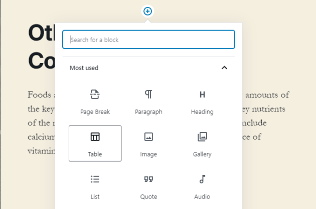
Adding tables in WordPress is simple. The Block Editor includes a dedicated Table block, which you can place in any post or page:
When you create a WordPress table, the editor asks you how many columns and rows you want it to include:
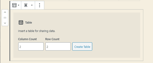
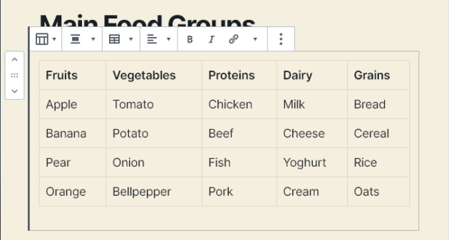
You can also modify these specifications later if needed. Once the table is in, you can fill it any way you want and edit its text just as you would a standard paragraph block:
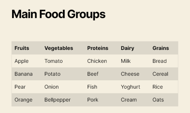
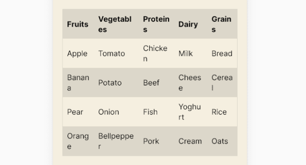
When you switch to the front end, most tables will look perfect:
However, things often start to get tricky when you access your website from a mobile device. The larger your tables are, the more likely it is their content will not display properly:
We’re using an example with very succinct content and a modest number of rows. The more text and rows a table contains, the more likely it will ‘break’ when you try to squish it into a smaller viewport.
This is not necessarily a deal-breaker for some people. However, it does mean your tables won’t be as engaging or readable as they could be.
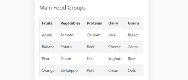
Also, keep in mind that we’re talking about HTML tables and some themes include different styles. In our earlier example, we used the default Twenty Twenty theme. Here’s that same table on the same mobile device using Astra:
However, unless your entire site is built around tables, you probably won’t want to switch themes just to ensure they display perfectly. The better approach if you’re happy with your current theme is to find ways to modify its table styles.
How to Create Responsive Tables in WordPress (2 Possible Approaches)
As usual with WordPress, there are two main ways you can tackle this problem – with a plugin or manually. We’ve explored both below.
1. Use a Plugin to Make Tables Responsive
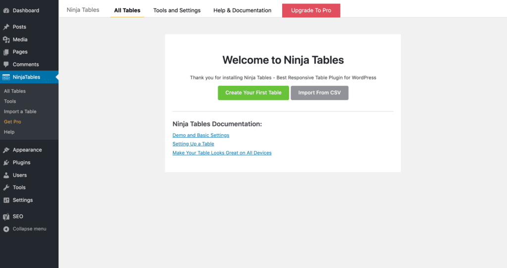
There are many plugins that can make your WordPress tables responsive. One of our favorites is Ninja Tables:

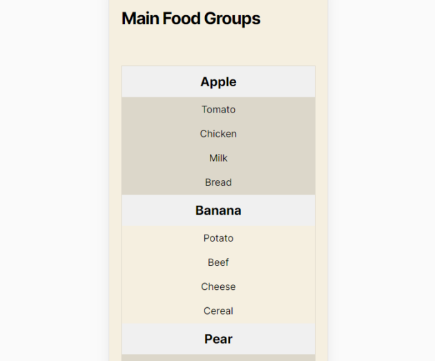
With Ninja Tables, you can use advanced features for mobile displays such as stacking your table’s columns, hiding specific columns, and more.
After you install and activate Ninja Tables, you can navigate to Ninja Tables > All Tables to create a new one:
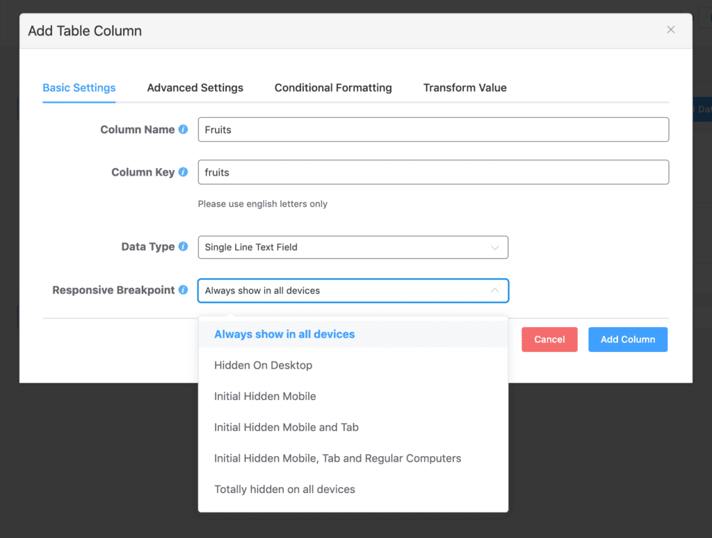
In the table editor, click on the Add Column button to start creating columns. For each, you’ll have the option to hide the entire column on desktop and/or mobile devices:
Once you’ve created all your columns, click on the Add Data button to create your table’s rows. When you’re finished, switch over to the Table Design tab.
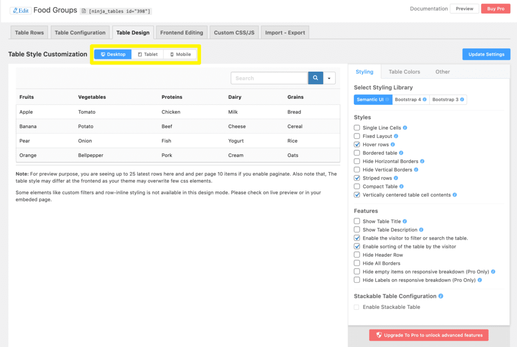
Here you can preview how your data will look on desktop, tablet, and mobile devices using the buttons above your table:
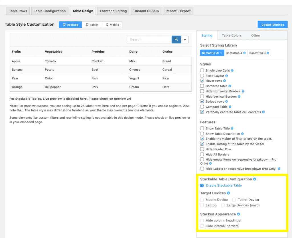
You can also generate stackable mobile displays by selecting the Enable Stackable Table checkbox and specifying which devices to apply this feature to:
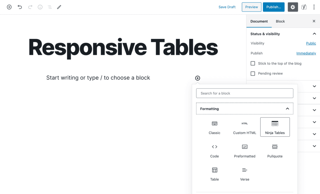
Finally, you can publish your table use the Ninja Tables block in the Block Editor:
While plugins such as Ninja Tables can help you create responsive tables in WordPress, they often require you to edit each table by hand, as seen above. This can become time-consuming, which is why you may want to tackle the issue through custom code.
2. Modify Your Theme Files to Make Tables Responsive
One solution for making tables responsive manually is to implement horizontal scrolling:

To do so, you’ll need to add a specific class to the HTML tables you want to make responsive, such as <table class=”responsive-yes”>.
Then, you can add this code to your theme’s style.css file:
@media only screen and (max-width: 640px) {

table.responsive-yes {

margin-bottom: 0;

overflow: hidden;

overflow-x: scroll;

display: block;

white-space: nowrap;

}

}
This sets a breakpoint using the max-width attribute. When the width of the viewport is below that size, your table will become scrollable. However, this isn’t the most elegant solution for displaying tables on mobile devices.
Alternatively, you could use a bit of CSS to stack your columns, like so:
This is our favorite method because it’s highly readable on the vast majority of screens, and makes it easier for visitors to interact with your tables.
To implement this change, you need to do two things:
- Add <thead> and <tbody> tags to your WordPress tables.
- Add a CSS code snippet to your theme’s stylesheet to configure a breakpoint and re-arrange your table’s columns.
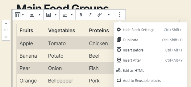
First, open the Block Editor and select the table you want to work on. Then click on the three-dot icon in the block toolbar and select the Edit as HTML option:
Editing your tables’ HTML using the Block Editor can be a bit tricky since it doesn’t include spaces. In a nutshell, you want to wrap your column headings using <thead> tags and the rest of your table content with <tbody> tags, like so:
<thead>

<tr>

<td>Fruits</td>

<td>Vegetables</td>

</tr>

</thead>

<tbody>

<tr>

<td>Apple</td>

<td>Tomato</td>

<tr>

</tbody>
That’s a shortened example to show you the gist of it. Once you add the requisite tags to your table, open your theme’s stylesheet and add the following code:
/* Credits:

    This bit of code: Exis | exisweb.net/responsive-tables-in-wordpress

    Original idea: Dudley Storey | codepen.io/dudleystorey/pen/Geprd */


@media screen and (max-width: 600px) {

    table {width:100%;}

    thead {display: none;}

    tr:nth-of-type(2n) {background-color: inherit;}

    tr td:first-child {background: #f0f0f0; font-weight:bold;font-size:1.3em;}

    tbody td {display: block;  text-align:center;}

    tbody td:before {

        content: attr(data-th);

        display: block;

        text-align:center;

    }

}
This sets your breakpoint at 600px and triggers a re-arrangement when you view the table on a smaller screen.
The only downside to this approach is that you have to add <thead> and <tbody> tags to all your tables manually. It’d be simpler to enable stackable displays with Ninja Tables.
Instead, we recommend checking out this JavaScript code (courtesy of the same author as the previous snippet), which enables you to automate that process.
Conclusion
If you rely heavily on tables to display data on your website, then you need to make sure they’re fully responsive. Default WordPress tables will display on mobile devices. However, depending on your theme, they may not adapt well to smaller screens, and you won’t be able to convey information as effectively.
There are two primary ways you can go about creating responsive WordPress tables:
- Use a plugin such as Ninja Tables to hide or stack columns on mobile devices for individual tables.
- Modify your theme files to make tables scrollable or stack their columns automatically.
Do you have any questions about how to create responsive tables in WordPress? Let’s go over them in the comments section below!
![[object Object]](/_next/image?url=https%3A%2F%2Ftorquemag.io%2Fwp-content%2Fuploads%2F2021%2F02%2Fgutenberg-plugin-wordpress.png&w=1080&q=75)